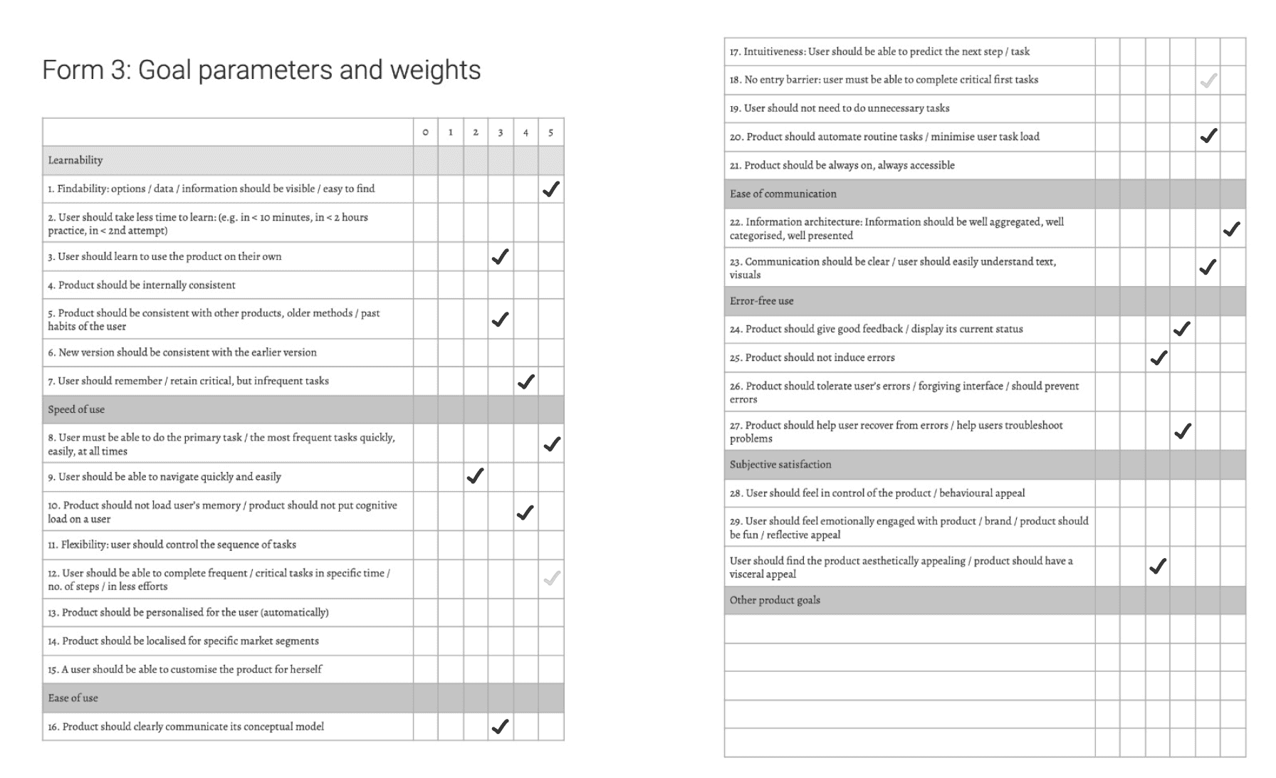
Ease of Communication
Error-free Use
Subjective Satisfaction
Goal Setting
Learnability
Speed of Use
Ease of Use
Enhance findability of Instiapp’s exclusive features by effective communication
Primary Goal
Findability - Increase user awareness about the app's features.
Ease of Use - Users should efficiently perform primary tasks swiftly and easily whenever needed.
Ease of Communication - Content to be effectively grouped, categorized, and thoughtfully displayed.
Ease of Use - Instiapp should automate routine tasks to minimise user efforts.
Learnability - The product should facilitate easy recall of crucial and infrequent tasks.
Ease of use - Enhance communication providing clear feedback to recover form errors and easy navigation.
User Experience Goal
Enhance efficiency for daily task.
Insti App’s exclusive features usage.
KPI
Check today’s lunch menu and avail your meal.
Find a second hand cycle to buy and contact the seller.
Finding the direction from hostel 17 to IDC
Find an upcoming sports event and share the same with your friend
Hierarchical Task Analysis
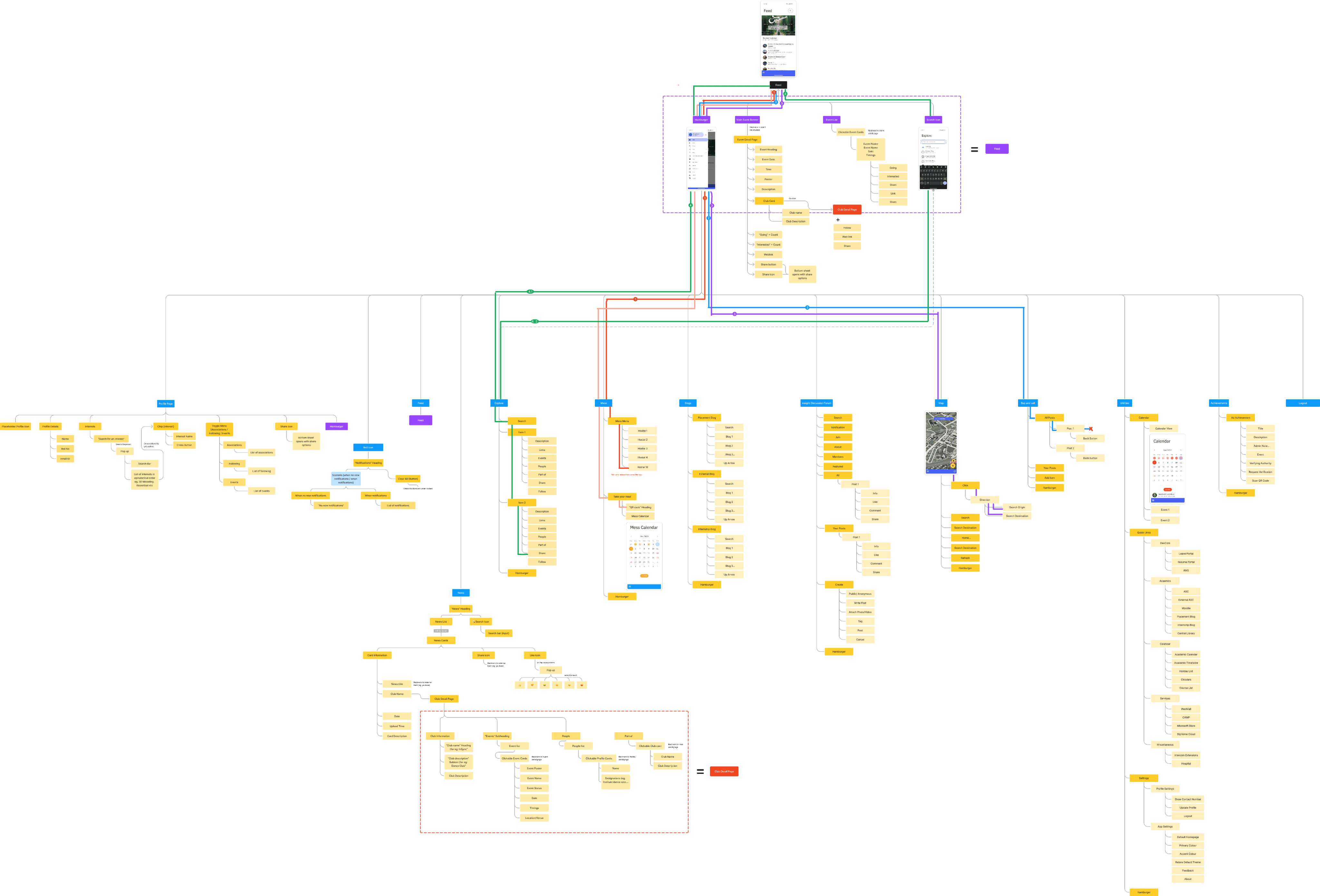
We then mapped the task paths directly onto the IA, which provided a clear visual representation of breakpoints, issues, inconsistencies, and redundancies in the system.

Instiapp
InstiApp is a comprehensive platform designed for the Indian Institute of Technology Bombay (IITB), catering to various aspects of campus life. It offers centralized access to information about events, clubs, organizations, academics, mess menus, placements, institute news, emergency contacts, and much more. Serving as a one-stop solution, it streamlines all institute-related activities for students.
Why Instiapp?
InstiApp is essential for completing certain exclusive tasks that have no alternative, making any issues with the app a source of significant inconvenience for students.
The app is vast in terms of its scope, usage, and functionality, playing a critical role in campus life.
With approximately 20,000 students across all hostels relying on InstiApp, its impact is widespread.
Lastly, as regular users of InstiApp, we personally experience its pain points, motivating us to address them.

Thanks!
Design Recommendation
Search Bar
Event image/slider
List for other events
Hamburger Menu
Mess menu
Buy & Sell
Map
Profile
QR Code
Hostel dropdown (User’s current hotel will be selected by default)
Mess Menu
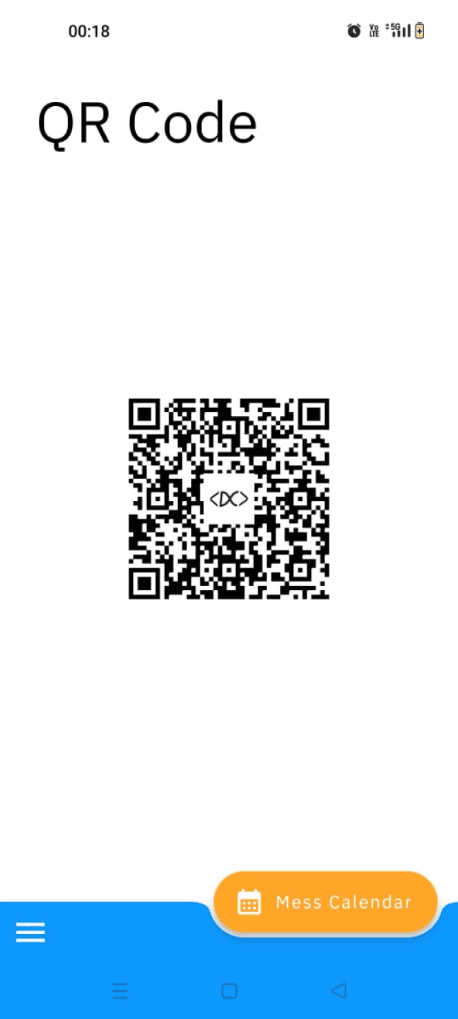
Scan QR code to avail your meal
Mess Menu
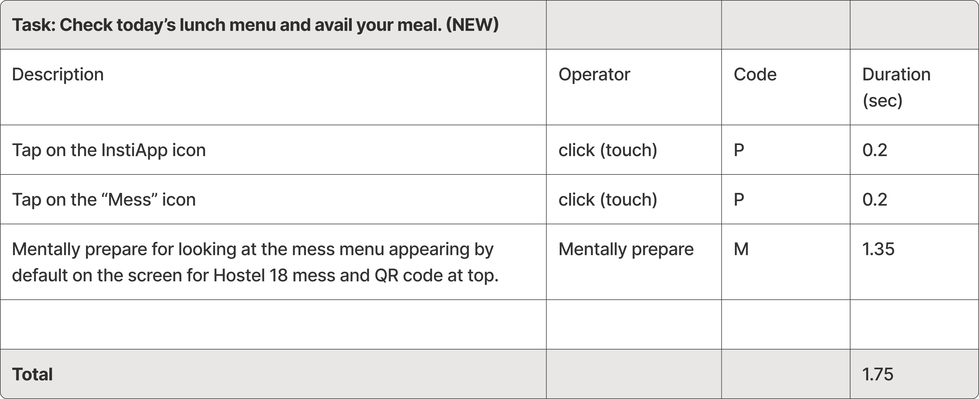
Time calculation for the existing app flow to perform Task 1
21k*
Total IITB
students
11k
Total IITB students
who use Instiapp
to avail their meal
Time taken by per student to avail meal
1.75 secs
7 secs
One time
x4
One day
Breakfast
Lunch
Snacks
Dinner
7 secs
x4
11k
77,000 secs (21.38 hrs)
wasted in a day by IITB students
+
=
in a year total ~365x21.38 = 7,807 hours wasted per year of all IITB students
So there is saving of
77.5%
Conclusion
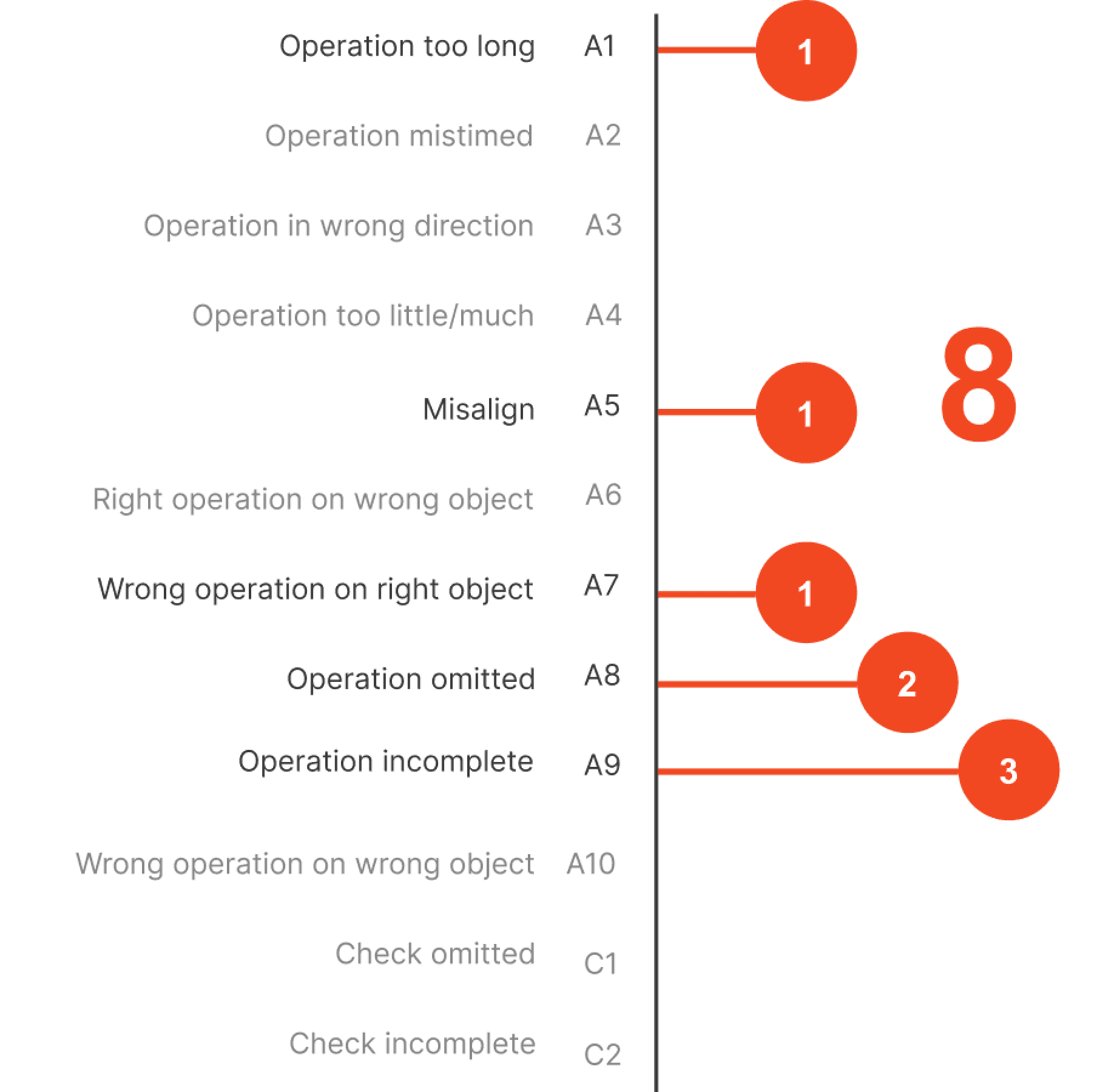
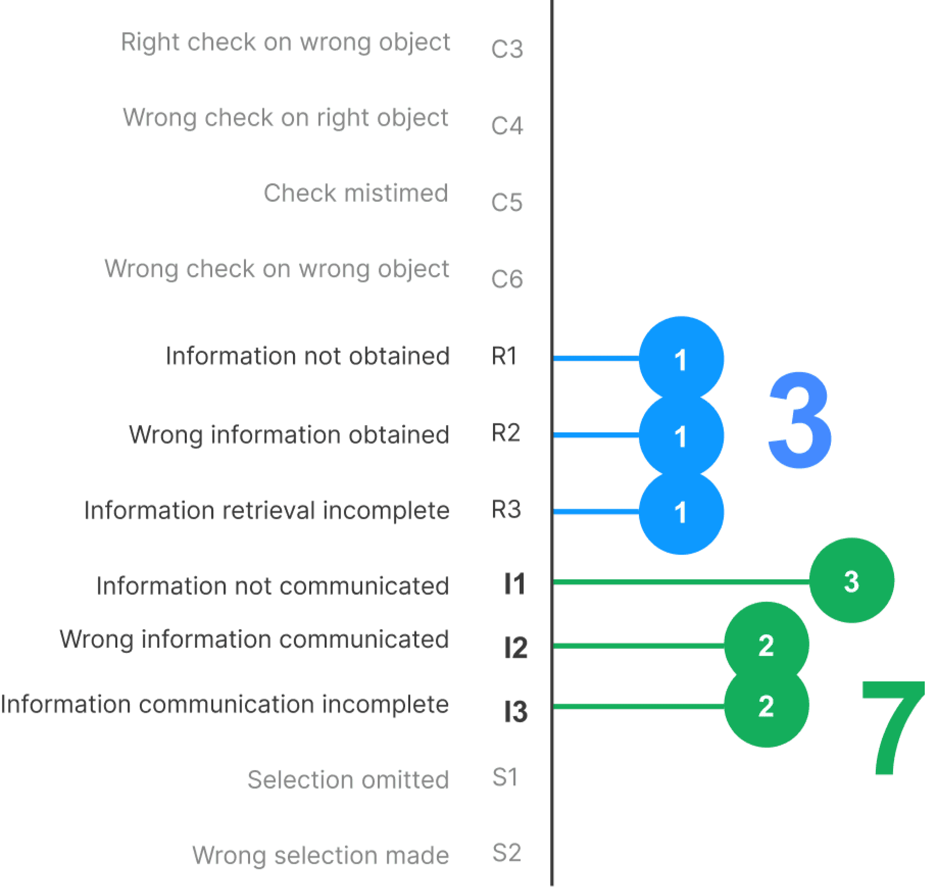
After analyzing the insights obtained from SHERPA, we concluded that it is required to give more attention to Action errors, retrieval errors and communication errors.
In only 4 flows we identified more than 55 errors across all the 10 usability heuristics.
In which “flexibility and efficiency of use” “visibility of system status” and “recognition over recall” have the highest no. of. errors.
We were able to reduce user flow and boost productivity for daily tasks by about 77% after implementing KLM.
We tried to work with the Structure and skeleton layer by rearranging navigational elements allowing the users to efficiantly interact with the core functionality.
Evaluating IITB Instiapp
Design Evaluation
Field
App Evaluation
Duration
3 weeks
Collaborators
Saikat Biswas |
Yash Karanjavkar |
Vijayanand Banhatti
Information Architecture
Process
Setting product goals for Primary user experience
Goal Setting
Defining tasks & performing Hierarchical Task Analysis
HTA
Rating & possible solutions for identified problems
SHERPA
Heuristics analysis on the screens involved in the task flows
Heuristic
For better comprehension
Information
Architecture
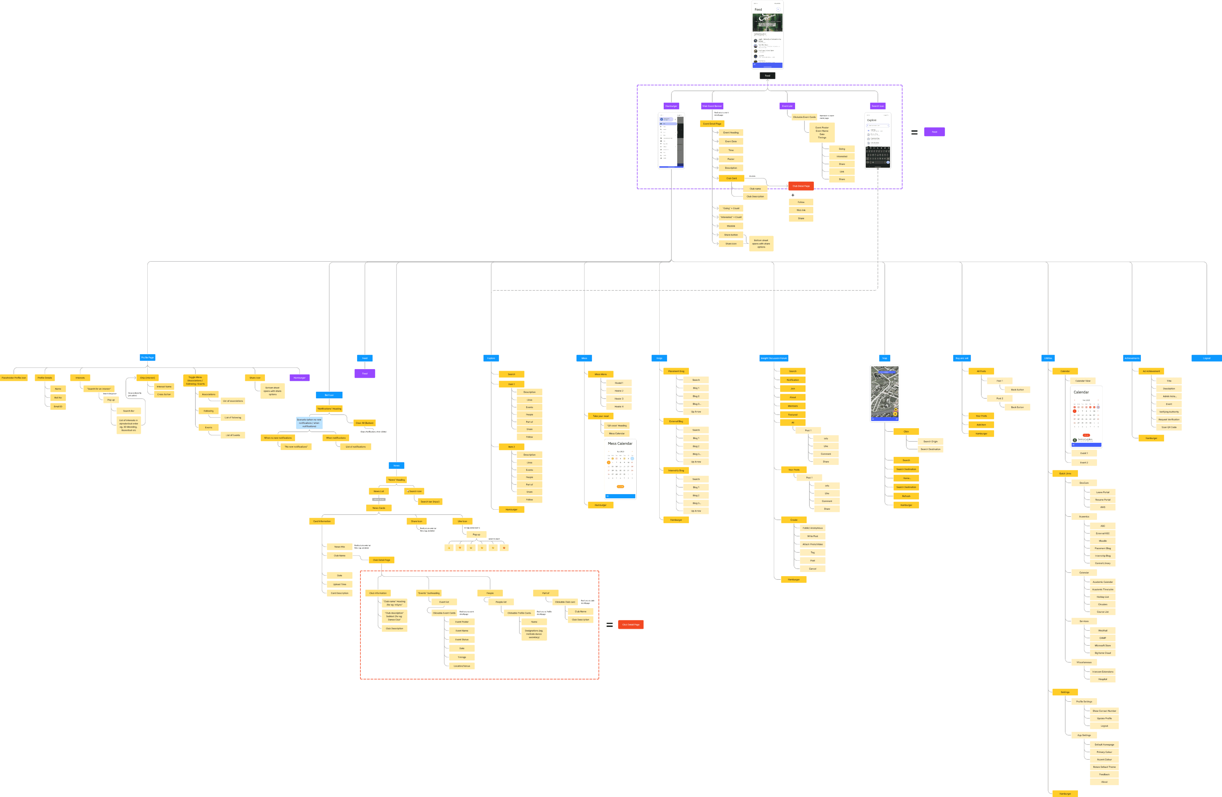
Creating the Information Architecture (IA) before conducting a Hierarchical Task Analysis (HTA) is beneficial because IA organizes information logically, providing a clear structure. This groundwork simplifies the HTA process, ensuring it is more efficient, focused, and aligned with user needs.
Insights through SHERPA
Action Errors
Retrieval Errors
Communication Errors
Heuristics Evaluation
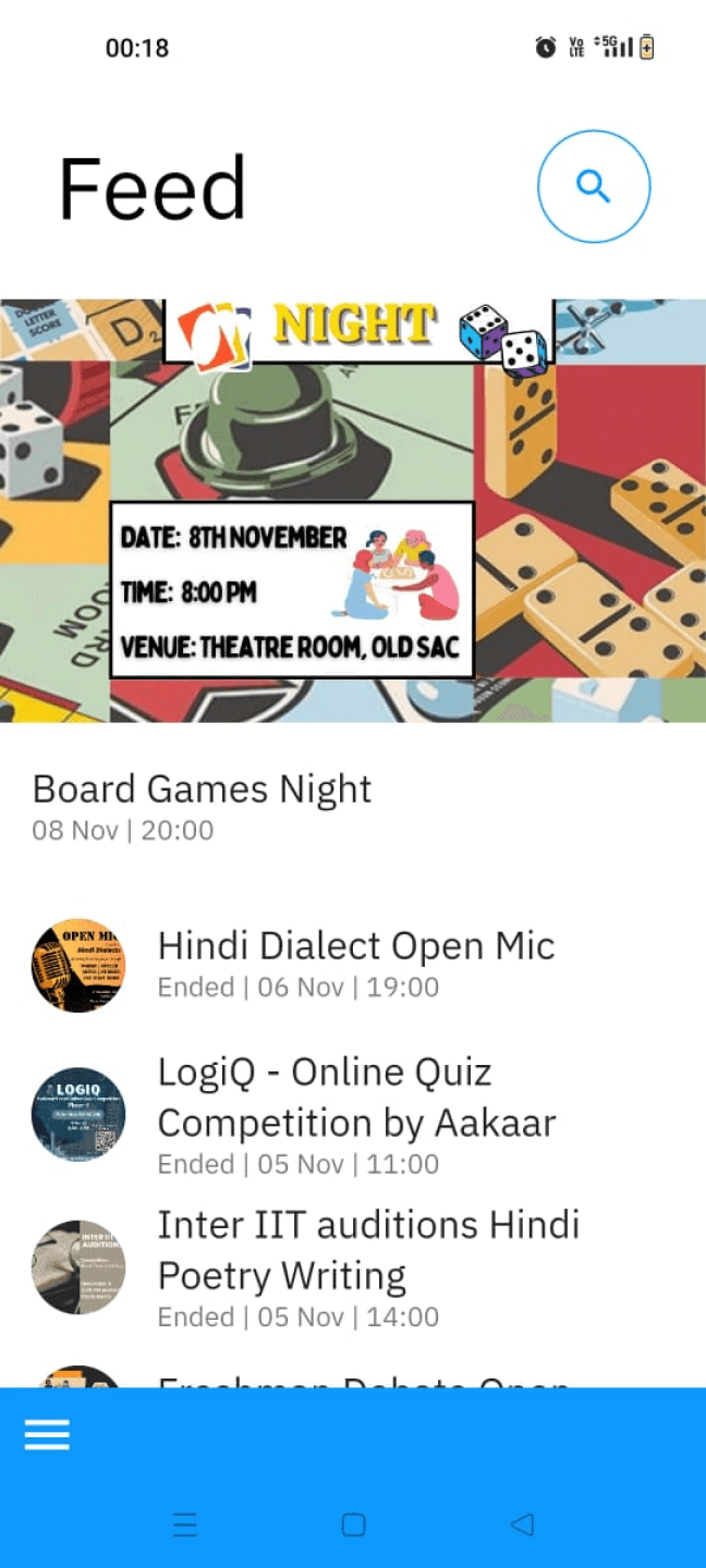
Hero event card and the secondary event cards are visually very different (eg, circular and rectangular images) and does not indicate that they are part of the same thing.
Visually the secondary events look like they are the part of “Board Games Night”
Events which are ended, are difficult to get recognized within the list, since there’s only textual communication.
Events which are ended, are difficult to get recognized within the list, since there’s only textual communication.
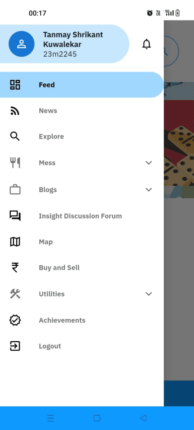
The color highlight on the selected tab and the profile section is same.
Options with dropdowns are greyed out to create visual distinction but it is not translating as the colours used are very similar to one another. And the user has to still rely on recall rather than recognition.
The “↓” down arrow has been given but it can still be emphasised
Logout button is the same colour as the rest of the options, however it can be emphasized using “red” colour as the common convention
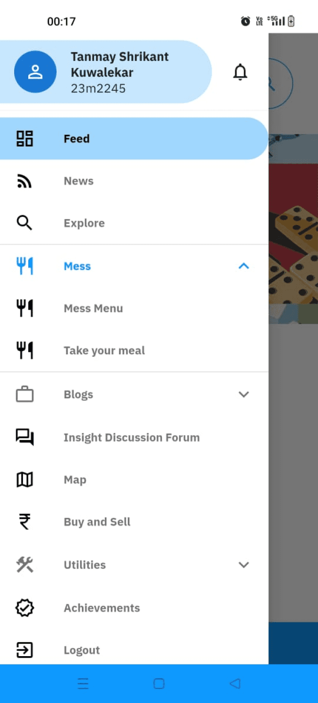
Using identical icons for both the category and sub-category creates confusion in distinguishing between different content types.
The note should be highlighted to be communicated properly, rather here it feels like a short description
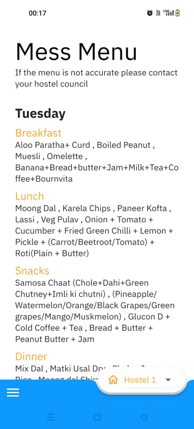
It is not indicated the mess menu is of which hostel, there is drop down selection menu at the bottom of the screen but it can often be missed. This can be fixed by either placing a text at top of the screen indicating the hostel no (Eg. H17, H1 etc), or placing the selection menu on the top.
By default, the mess menu of Hostel 1 is displayed to residents of other hostels, causing an unintended sharing of information.
The back interaction closes the app, rather it should take them to the previous screen

Milk status can be shown separately as the students are only allowed to take one glass of milk per day. So, this can be an opportunity to show visual representation of the mental model
Heuristics Evaluation Task 01
Check today’s lunch menu and avail your meal
Essential information has been mistakenly placed within a different sub-category, potentially making it harder to find and it fails to provide important information to the user.
And after the app is reopened the initial app position is not retained and opens on the home page, so the user has to repeat the task flow again
errors identified
in Task 01
14
Similarly identified errors for Task 03 & 04
Heuristics Evaluation Task 02
Find a second hand cycle to buy and contact the seller
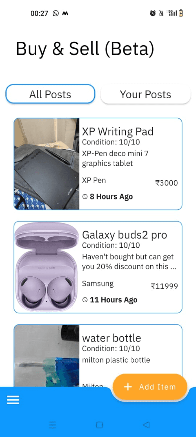
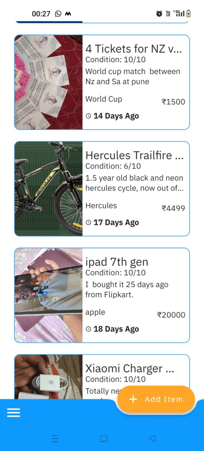
There is no search bar feature to quickly look for a type of item - limiting user control
The screen header disappears after scrolling and the page loses its identity. The designers might have done this to save screen real estate but this design choice can be revisited if possible.
The upload date is given priority over the product price in the hierarchy with highlight. However, importance should be given to the pricing.
Items cards have incomplete information for both item name and description. This provides two sets of incomplete information.
However if they remove the item descriptions from the cards - the card design would be simpler, and the cleared space could be used to show the complete product name.
Setting the condition scale from 1 to 10 reduces the relevance and use of the first half (1 to 5) of the scale. Instead, a shorter word scale can be used to depict the condition of the product.
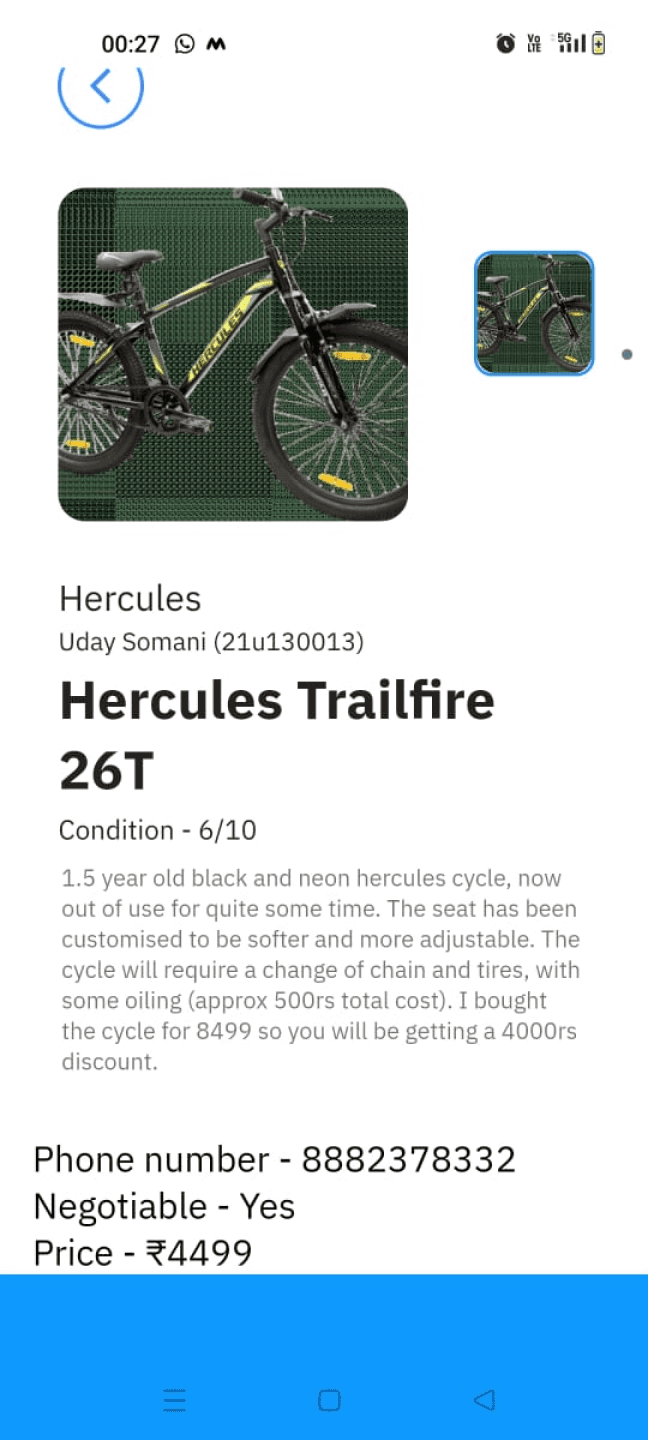
When there are more than two images, a vertical scroll is utilized, which might not be very intuitive for users.
Additionally, there's a lack of information hierarchy every text is prominently displayed in equal size, failing to give proper emphasis to the contact number and price.
The back button/ is only available on specific screens, leading to inconsistencies in both user experience and the design.
It's not possible to zoom in on the image for a closer and clearer view.
The absence of a clear hierarchy in presenting information.
There is no direct option available to call the seller, and users are also unable to copy the phone no.
There is default sorting done as per number of days. In case the user wants to sort based on price, or any type or any other category, its not possible.
The “All Posts” is actually buy and “Your Posts” is sell from user point of view
errors identified
in Task 02
14
Total 55 Errors Identified
errors identified
in Task 01
14
errors identified
in Task 02
14
errors identified
in Task 03
17
errors identified
in Task 04
10
Tally of heuristic evaluation

Nielsen's Ten Usability Heuristics
Visibility of System Status
Match between System and the Real World
User Control and Freedom
Consistency and Standards
Error Prevention
Recognition Rather Than Recall
Flexibility and Efficiency of Use
Aesthetic and Minimalist Design
Recogise, Diagnose, and Recover from Errors
Help and Documentation
Goals, Operators, Methods and Selection rules (GOMS) Using KLM
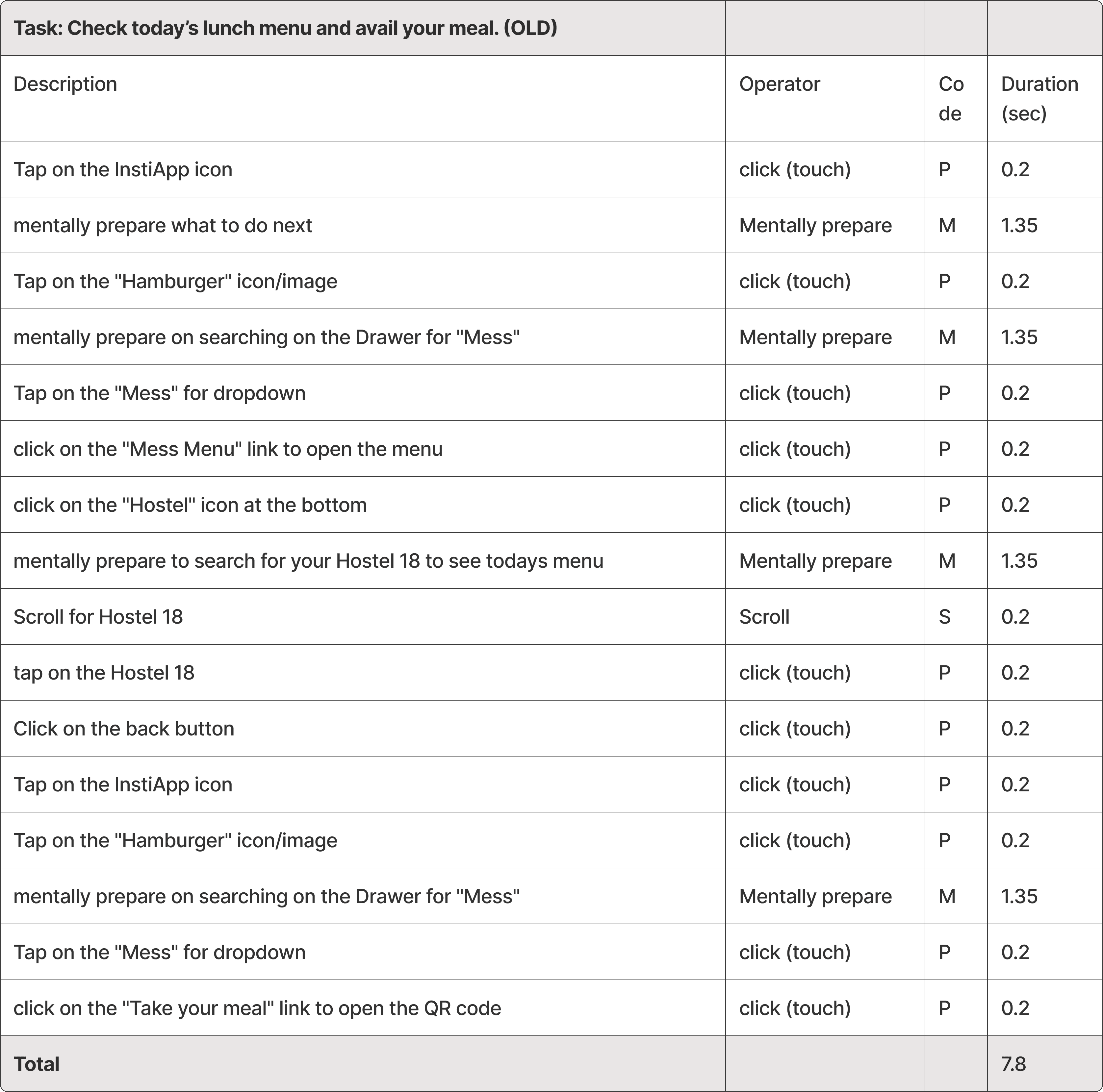
GOMS performed on existing app flow for Task 1, as it is the daily performed task
(4 times)
Time calculation for the existing app flow to perform Task 1
21k*
Total IITB
students
11k
Total IITB students
who use Instiapp
to avail their meal
Time taken by per student to avail meal
7.8 secs
31.2 secs
One time
x4
One day
Breakfast
Lunch
Snacks
Dinner
31.2 secs
x4
11k
3,43,000 secs (95.33 hrs)
wasted in a day by IITB students
+
=
in a year total ~365x95.33 = 34,755 hours wasted per year of all IITB students

